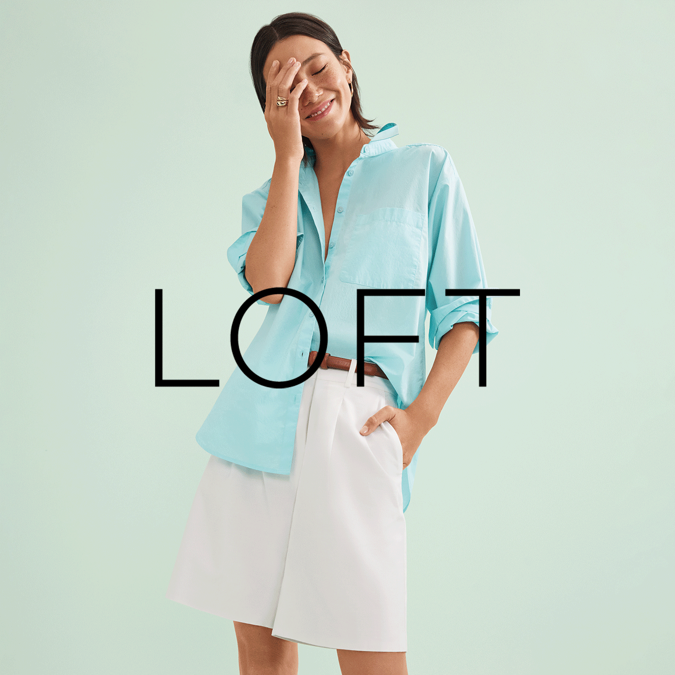
When I was hired at LOFT, I was tasked with refreshing all of our digital paid media (supported on Meta, Instagram, Pinterest, etc.) that we use to promote new collections as well as various marketing initiatives. In addition to weekly promotional assets, I also own the monthly editorial assets and have worked hard to push the envelope with each new design.
Press Send is an advice podcast hosted by Chinae Alexander. Whether it’s navigating dating apps, tips for starting a business, or how to own your voice confidently, Chinae brings her trademark honesty to the questions, big and small, that many are asking. Since this podcast covers everything from relationships to finances to wellness, I wanted to create visuals that felt authentic to the show itself, so I thought stickers specific to each topic could be a fun, unique approach. In addition to building and coding the Press Send website, I designed each social post to have corresponding stickers so that listeners can know which topics to expect from each episode. You can check out the full website here.
LOFT launched three different Beach Getaway/Swim collections throughout the spring 2024 season, and I owned the all of the digital projects for these drops across site, email, and paid media platforms.
During my time at redpepper, I participated in their annual CreateAthon, an event where the entire company pauses client work and stays up for 24+ hours straight, making marketing magic for three local nonprofits. Our team worked on campaign materials for YEAH!, a nonprofit charitable youth arts organization that amplifies voices from all communities through music education, and I was lucky enough to have the opportunity to illustrate and design this rockin’ poster series that highlights the individualism and freedom of expression YEAH! campers experience.
Chinae Alexander is an entrepreneur, lifestyle personality, writer, speaker, and wellness expert based in Brooklyn, New York. Since Chinae is spunky and fun, I wanted her brand to reflect just that. Along with building and coding her website, I also designed a set of shop stickers for LTK links, branded pitch documents, a set of GIFs that live on Instagram Stories, a set of wallpapers for Instagram Q&As, Instagram highlight covers, a monthly newsletter with over 5k subscribers, and an evergreen blog that lives on chinaealexander.com.
These are just a handful of editorial emails and homepage hero banners that I've designed to support new LOFT collections, promotional offers, and other various marketing initiatives.
While with redpepper, I spent a lot of my time designing for Christie Cookie Co., a Nashville bakery known as the creator of the famous DoubleTree cookie. Our team was responsible for creating most of the materials for their 2021 Holiday Campaign. For this campaign, I not only designed numerous cookie tins (i.e. Holiday Charms, Merry Christmas, New Year’s, etc.), but also created the 24 page Holiday Gifting Catalog that they send out to customers every year.
*Tin designs pictured in catalog
The annual Frist Gala is one of the premier social events in Nashville and serves as the primary fundraiser for the Frist Art Museum. This specific design direction takes thematic inspiration from the Frist Gala exhibition Italian Style: Fashion since 1945.
In an effort to make the world a kinder, happier place, the idea of the experiential World Kindness Day Campaign was born. In an ideal world, this campaign would be a collaboration with the non-profit organization, kindness.org. The overall concept involves a unique version of a vending machine: the “Kindness Kiosk.” The idea is that several of these kiosks would be placed in various locations throughout New York City. Once the red button is pushed, the machine would spit out a “Kindness Card.” Each of the cards reveal a simple random act of kindness. The hope is that these Kindness Kiosks would attract curious people from all over the city, encourage them to grab a Kindness Card, and ultimately inspire them to complete the random act of kindness creating a citywide movement. After all, in the words of kindness.org, “every kind act matters.”
“Just My Type” is a food booklet intended to educate the foodie nation on a specified list of popular ingredients. Each spread spotlights a specific food and presents readers with unique information about the food in a visually interesting way. Illustrations and handwritten elements created by yours truly.
The North American Lighthouse Recipe Book is a cookbook that pairs specific meals with certain lighthouses found in different regions of the United States. I strategically tried to stick to a warm color palette consisting of oranges, yellows, and reds because these are the top three colors that stimulate appetite. In addition, I chose to use yellow and orange photo manipulations as my main visual components (e.g. lighthouses, bird, boat, etc.) in order to simultaneously create a feeling of consistency, yet variety throughout the entirety of the cookbook.
Through unique clothing, footwear and accessories intended for skate and active lifestyles, this youthful, yet sleek Zumiez brand aims to remind everyone of their right to express their individuality.
What’s a podcast without a good theme song? Thus, I created this cover art for the song Press Send written by producer, mixer, and composer, Craig Almquist.
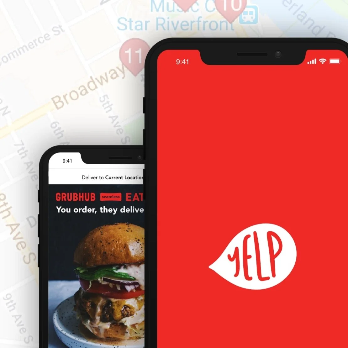
While I appreciate the current Yelp app, I do believe that it could use a little bit of a design refresh. The logo seems to be a little random for the services that are presented within the app, and the content itself is a little disorganized and overwhelming. With that said, I focused on three specific things when going through the hypothetical rebranding of this app: simplicity, organization, and modernization. As far as the new branding itself goes, I wanted to give Yelp a fresh look that aligned more closely with the idea behind the app: reviews. When people use Yelp, they are putting their voices out into the world for them to be heard in hopes that they can help persuade future consumers. This is the exact reason why I wanted the logo to be centered around a speech bubble. I tried to stay true to the traditional Yelp red and white while still giving the brand itself an entirely new feel that is hopefully more simplistic and clear. But, it doesn't stop there! In addition to an identity refresh, I designed a promotional Facebook advertisement as well as a 1/4 page print advertisement that is intended for Travel + Leisure Magazine. These advertisements are just a little peek into what the marketing materials for this new and improved Yelp app would look like.
Now for the FUN stuff! If you can’t already tell…I am a big fan of color. When it comes to choosing color palettes for a design project, I am your girl. I especially enjoy working all kinds of colors into my illustrations, logos, graphics, and patterns. Throughout the past couple of years, I have spent a good chunk of my time creating illustrations for various projects as well as blog thumbnails for Chinae Alexander. These are just a few of my favorites.